Visualization
DOHA web application has been built with consideration of state of the art research in web cartography. Visualisation is a process of “translation of geospatial data into maps” (Kraak, 2001 9). Visualisation can be applied to four different approaches, which vary depending upon the purpose of the final map (Kraak and Ormeling, 2003).The approaches are:
- To explore and play with unknown and raw data
- To analyse known data by manipulation
- To access the data behind the maps
- To present the data by specially designed map
The variety of roles played by the maps has been classified in two main categories (DiBiase, 1990):
- “Private visual thinking”- the user perform the analysis of their own data
- “Public visual communication” – this process requires well-designed maps.
MacEachren (1994) introduced the concept of measuring the purpose of the map by using the three-dimensional space of a cube. The purpose of the map changes along the diagonal axis of a cube from private use which reveals unknown patterns in the data, to presenting known data in the public domain. This approach was also used by Kraak and Ormeling (1996). The lower corner of the cube represents maps designed for the public based on known datasets. The opposite corner represents maps used in private to explore raw data.
 The map use cube proposed by Kraak (2001)
According to Kraak and Brown the whole process of visualizing data is guided by one sentence:
“How do I say what to whom, and is it effective?” (Kraak, 2001, 9).

Visualisation process ( Kraak, 2001)
Representation of time
Doha's urban developement has been represented using a series of maps and aerial photography, each representing a 'snapshot' of the town at a particular time. User can compare these images to get an idea of change and urban growth.
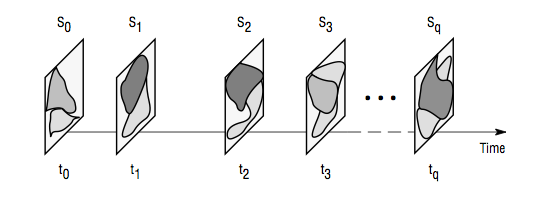
GIS Data Model for representing spatio-temporal data. Each 'snapshot' represent a state for a given point in time (Peuquet, 1999)